Making Your Sign-Up Form Stop Scaring People Away
Why your form feels like an interrogation… and how to make it feel like a friendly handshake instead.
Your Form Might Be the Problem.
You’ve got traffic.
People visit your site.
They even hover over your sign-up form.
And then?
They disappear.
You wonder if your offer needs tweaking.
If your traffic’s low quality. If you need a fancy chatbot or a viral campaign.
But often, the real problem is way smaller:
Your sign-up form feels like an interrogation.
Instead of saying, “Welcome in,”
It screams, “Prove yourself first.”
This post is about fixing that. No jargon. No complex funnels. Just practical moves to turn your form into something people want to fill out.
Here’s what we’ll cover:
- How to ask for less and get more
- How to make people feel safe handing over their info
- How to design forms for human fingers, not developer brains
- How to clearly say what happens after someone hits submit
- How to instantly follow up so leads don’t go cold
Let’s turn that scary little box into your best-performing asset.
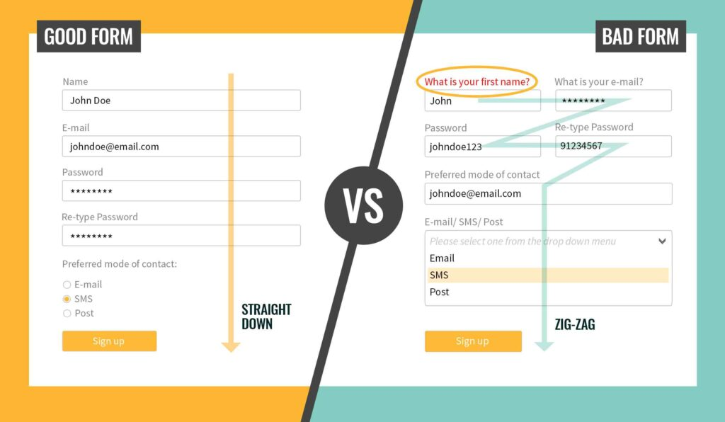
Stop Asking So Many Questions
If your form has more than three fields, it’s probably costing you leads.
People hate forms that feel like paperwork.
When you ask for their job title, company size, phone number, and zip code before even saying hello, it feels cold and pushy.
Here’s how you can flip that experience:
- Only ask what you absolutely need to start a conversation. Most businesses only need two things to get started: a name and an email. Maybe a phone number, if it’s a call-based funnel. That’s it. You can collect more data later on, after trust is built.
- Use smart defaults and progressive profiling. Tools like Typeform or ConvertFlow let you show different fields over time. Returning users can give you more info as they interact again.
- Make optional fields actually optional. Mark them clearly. Or better yet, remove them.
- Avoid dropdown hell. Asking someone to choose from 47 options for “industry” or “budget” before you’ve given them value? That’s not discovery—it’s friction.
Here’s what happens when you simplify.
When Imaginary Landscape cut their form from 11 fields down to just 4, their conversion rate more than doubled—from 5.4% to 11.9%. More questions don’t mean better leads—just fewer people willing to fill them out.
Because here’s the truth: More data too early just scares them off.
Look at your form today. Remove two fields. See what happens.
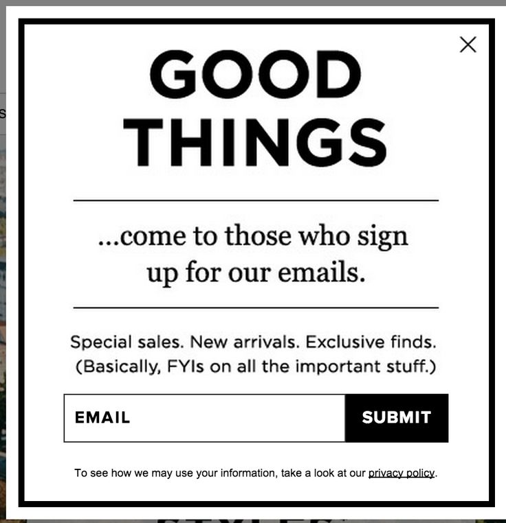
Make the Form Feel Like a Safe Place
If people don’t trust your form, they won’t fill it out, no matter how short it is.
People aren’t afraid of forms.
They’re afraid of what happens after they fill them out.
Will they get spammed? Cold-called? Subscribed without consent?
Trust is the real form killer.
Build trust, field by field:
- Explain why you’re asking for info. A small sentence like: “We’ll only use your email to send the resource you requested—no spam, ever.” It’s basic. But it matters.
- Use plain, friendly language. “Join the waitlist” sounds better than “Submit your inquiry.” “Grab your free copy” beats “Download now.”
- Show social proof nearby. Logos of clients, testimonials, or even “2,315 people signed up this month” builds confidence.
- Make it feel human, not corporate. Add a photo of a real team member. Include a short note like, “We’re real people. We read every submission.”
Let’s take a cue from Superhuman (the email app). It has a waitlist form that’s intentionally personal.
It tells you exactly what to expect next, who will contact you, and why they’re asking each question. The result? Higher-quality leads and less form abandonment.
Avoid using cold, robotic language—“Submit your request to be contacted by our team.” Instead of conversational copy like “Send me my guide”
After today, add one friendly sentence under your email field that says exactly what you’ll do with their info.
Design for Mobile First. Desktop Can Wait.
If your form is hard to use on a phone, you’re losing half your leads.
We live on our phones. Yet most forms still look like they were designed for a desktop in 2012.
- Over 50% of web traffic now comes from mobile devices.
- Mobile users convert 70% less often if your form is hard to use (Insiteful.Co)
What can you do about this today?
- Make buttons big enough for thumbs. Your “Submit” button shouldn’t require precision aiming or zooming in.
- Use one column, not two. Two-column forms break awkwardly on mobile and frustrate users.
- Auto-format inputs. Let people type in their number or date naturally. Don’t force dashes or parentheses.
- Avoid dropdowns unless necessary. Especially for things like “Country.” Use smart defaults (e.g., auto-detect location) instead.
Here’s another example from Fathom Analytics… a privacy-first Google Analytics alternative. They redesigned their entire sign-up flow to be mobile-optimized.
Clean buttons. Short steps. No dropdowns.
Result? 22% increase in mobile sign-ups within one month.
Quit testing your form on desktop only. That’s not how most of your users see it.
Action Step: Pull up your form on your phone. Be honest: is anything annoying to fill out? Fix that first.
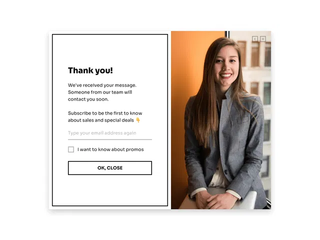
Tell People What Happens Next
A form with no clear next step is like shaking someone’s hand… then walking away silently.
When someone hits “submit,” they’re at their highest level of interest. Don’t ghost them.
Turn your thank-you page into a next step:
- Tell them what happens now. “Thanks for signing up! We’ll be in touch within 24 hours.”
- Give them something to do while they wait. Offer a resource. Let them schedule a call. Send a personal welcome video.
- Make it feel warm and personal. Include a smiling photo of a team member. Add a short thank-you message.
Why this matters:
- People hate feeling like they’re in a black hole.
- Clear next steps improve perception, increase trust, and reduce no-shows.
Take for example, Productive Shop (a B2B marketing agency). It significantly boosted post-form engagement by adding a short video from the founder on their thank-you page—walking leads through what to expect next and how to prepare. That single tweak helped increase conversion rates by up to 80%, thanks to the trust and clarity it built right after submission.
It’s not enough for your thank-you page to say only: “Thanks. We’ll be in touch.”
That’s the digital version of a shrug.
Instead, add a next-step sentence or call-to-action on your thank-you page today.
Use the Info Fast— Or Lose the Lead
The most valuable moment in your funnel is right after someone clicks “Submit.”
People are most excited now. Not tomorrow. Not next week. Now.
If you’re slow to follow up, that excitement fades… and so does your chance of closing the deal.
Here’s how to stay fast:
- Send a helpful auto-response instantly. Not just “Thanks.” Offer a clear next step, resource, or booking link.
- Trigger internal alerts to your team. Let someone know instantly when a new lead comes in.
- Pre-fill your CRM or project board. Use tools like Zapier to auto-log form info into the systems your team already uses.
- Segment and personalize early. Even with basic info (like company name or role), you can tailor your outreach.
You can take a cue from DesignJoy, a one-man design subscription business. Brett built an entire lead-handling process from one form.
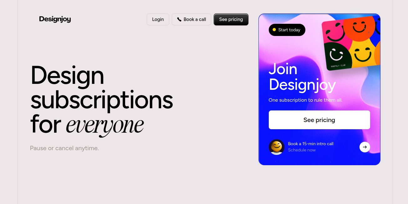
It sends an auto-reply, updates his Notion CRM, and pings his Slack—all within seconds.
That speed makes his business feel way bigger and more reliable than it is.
You’re better off not treating the form as the end of the journey instead of the beginning.
You can set up one smart automation today that alerts your team or sends a helpful follow-up message.
In Conclusion…
Fixing Your Form Is the Fastest Way to Fix Your Funnel
The best tech in the world won’t help if your sign-up form scares people away.
But when it’s done right? It becomes your quietest, most consistent salesperson.
Let’s recap:
- Ask less, not more
- Build trust before you collect info
- Design for fingers, not cursors
- Guide people after they submit
- Follow up fast and personally
When your form feels easy, warm, and human, something magical happens: More people say yes.
If your form needs fixing… and your team doesn’t have the time or skillset to redesign it right…
This is where ScaleTechies steps in.
We help growing businesses remove the friction between people and tech. Our flat-rate subscription gives you on-demand access to smart, speedy devs and designers who actually care about outcomes… not just deliverables.
Ready to turn your form into your best closer? Let’s build something people want to fill out.