The Three Ways People Leave Your Site Without Buying

Your website isn’t just a digital storefront—it’s a 24/7 sales machine.
But here’s the problem: Most visitors leave without ever making a purchase.
This isn’t just about getting more traffic.
You don’t need more visitors—you need to stop losing the ones you already have.
There are three major reasons people leave before they buy:
- The First Impression Bounce. Visitors leave within seconds because your site loads too slowly.
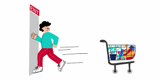
- The “Almost There” Cart Abandonment. They add items to their cart but never complete the purchase due to friction in the checkout process.
- The Confusion Exit. They get lost in a messy site structure and can’t find what they need.
Each of these exit points represents a revenue leak—money slipping through the cracks without you realizing it.
But the good news? They’re all fixable.
In this post, we’ll break down exactly why visitors leave…
how to spot the warning signs, and most importantly…
what you can do today to stop losing customers and start increasing conversions—without needing more traffic.
Let’s dive in.
A Slow Website Is an Expensive Mistake
If your website takes too long to load, visitors leave before they even see what you offer. Speed isn’t a feature—it’s a revenue multiplier.
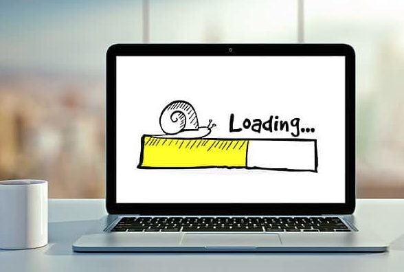
The first few seconds decide everything. Over 50% of users abandon a site that takes longer than 7 seconds to load. That’s half your potential customers—gone—before they even engage.
Slow sites kill conversion rates. A 1-second delay reduces conversions by 7% (BigCommerce). If your site makes $100,000 a month, that’s a $7,000 monthly loss—all because of load time.
Cluttered, flashy designs slow everything down. Heavy images, autoplay videos, and complex animations don’t just slow loading times—they create friction. BBC News found that for every extra second of delay, 10% of users left.
Speed impacts SEO and ad performance. Google penalizes slow sites in search rankings. Worse, if your landing page loads too slowly, ad platforms charge you more per click because fewer people stick around.
Fixes that instantly boost revenue. Compress images, remove unnecessary scripts, and use a content delivery network (CDN). When Walmart optimized load times, conversions increased by 2% for every second saved.
A slow website isn’t just an annoyance—it’s a direct hit to your bottom line.
Optimize speed, and you’ll convert more visitors into paying customers.
Case Study: AliExpress – A 36% Boost in Orders by Improving Speed
AliExpress cut their page load time by 36% and saw a 10.5% increase in orders and a 27% rise in new customer conversions.
Speed directly impacts revenue—slower sites lose buyers.
A Slow Checkout is a Leaky Bucket
Even if your site loads fast, you can still lose customers at the last step: checkout.
Every extra second… every unnecessary click… and every bit of friction increases the chances they abandon their cart.
Checkout should be fast and effortless. 7 in 10 online shopping carts get abandoned. Slow load times increase this rate by 75% (Baymard Institute)
If you make checkout complicated, people will leave—no matter how much they wanted to buy.
Forcing account creation is a conversion killer. One of the biggest mistakes? Forcing people to create an account before they can purchase. Studies show 24% of cart abandonments happen because of forced sign-ups. Offer a guest checkout option to keep sales flowing.
Every extra step costs you customers. Amazon’s 1-Click Checkout changed the game for a reason: fewer clicks mean more completed purchases. Reduce unnecessary form fields and auto-fill customer information whenever possible.
Speed impacts trust and credibility. When Walmart optimized its checkout speed, conversions increased by 2% for every second saved. A slow or clunky checkout process makes customers second-guess their decision.
Fix it before they abandon ship. Test your checkout process. Time how long it takes to buy something. If it’s more than a few seconds, you’re losing money. Small optimizations—faster page loads… fewer form fields… and autofill options—can add up to massive revenue gains.
A slow homepage loses visitors. A slow checkout loses paying customers. Don’t let friction cost you revenue.
Simpler, faster checkouts prevent last-minute drop-offs.

A Confusing Website is a Silent Revenue Killer
Even if your site loads quickly and checkout is seamless… visitors will still leave if they can’t figure out where to go. Confusion kills conversions.
Users don’t “explore” confusing sites—they leave. According to Google, design and navigation make up 94% of first impressions.
If users can’t find what they need in a few clicks… they assume you run a disorganized business—or worse, that you are untrustworthy.
Too many options create decision paralysis. When Hick’s Law tested decision-making, they found that more choices slowed people down. If your site has too many buttons, menus, or distractions, customers get overwhelmed and leave.
Your site’s layout should mirror how people think. Apple stores are designed to lead customers naturally from browsing to buying. Your website should do the same. The most important actions—like booking a demo or adding to cart—should be obvious and effortless.
Bad search functionality loses potential sales. 43% of e-commerce site visitors go straight to the search bar, but most site searches fail due to poor results (Baymard Institute). If people type in a product and get irrelevant results, they won’t keep looking.
Fix it by prioritizing clarity over creativity. Simplify your menus, remove unnecessary steps, and highlight the next logical action. Amazon’s entire business is built on reducing friction—your site should be, too.
A Case study from Airbnb: Clearer Navigation Increased Bookings
Airbnb redesigned its homepage to prioritize search and personalized recommendations. This led to a higher conversion rate from casual browsers to booked stays.
A slow site turns visitors away. A slow checkout turns customers away. But a confusing site? That turns everyone away.
Clear site navigation keeps visitors engaged and drives purchases.
Fixing Revenue Leaks: Small Changes, Big Wins
If people leave your site without buying, it’s not random—it’s predictable. The good news? Fixing these issues doesn’t require a full redesign. Small, strategic changes can unlock massive revenue.
Start by identifying your biggest drop-off points. Use tools like Google Analytics to see where visitors leave. If they bounce in seconds, it’s a speed issue. If they abandon checkout, it’s a friction issue. If they visit multiple pages but don’t convert, your site structure needs work.
Reduce checkout friction to stop abandoned carts. Guest checkout, fewer form fields, and a clear progress bar can increase completed purchases. Amazon mastered this—so should you.
Make navigation intuitive, not creative. People don’t browse websites; they hunt for what they need. Follow Apple and Amazon’s lead: prioritize clarity over clever design.
A case study from Etsy: A/B Testing the Add-to-Cart Button Boosted Sales
Etsy ran an A/B test on their add-to-cart button placement and found a version that increased conversions by 8%… proving that small tweaks can drive big revenue gains.
Your website isn’t just a digital brochure. It’s your 24/7 salesperson. Eliminate friction, and it will convert more visitors into paying customers… without needing more traffic.
Test, tweak, and optimize continuously. Websites aren’t “set and forget.” Run A/B tests on load times, checkout processes, and navigation flow.
A single improvement—like Walmart’s checkout speed fix—can increase conversions by 2% per second saved.